These days, creating a logo can seem incredibly easy, a few clicks with design software or AI, and you’re done.
But designing a logo isn’t just about making something that looks nice.
A real logo is the result of analysis and a deep understanding of the brand.
A graphic designer doesn’t just “make things look good”, they translate what the client wants (even when they don’t know how to express it) into a visual identity that is consistent and built to last.
An AI-generated logo might be beautiful, but is it truly functional and representative? I don’t think so.
LOGO DESIGN
SCAMPATOUR

This logo was born from a deep understanding of ScampaTour’s audience, curious travelers seeking authentic, cultural experiences.
The signpost symbol conveys reliability, exploration, and safety, reflecting the brand’s promise to guide adventurers off the beaten path.
Its dual arrows suggest freedom of choice and well-curated flexibility.
The color palette, earthy red and volcanic brown, balances passion and stability, echoing the brand’s roots in Japan and Iceland.
A visual identity designed to inspire trust, curiosity, and a love for meaningful travel.
CREATU
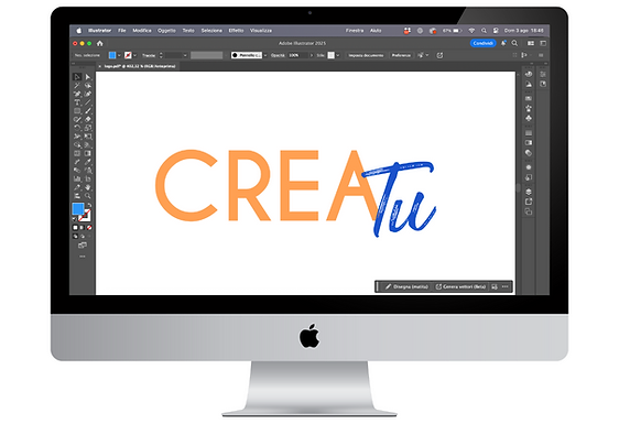
This logo captures the essence of creative freedom and personal expression.
“Crea”, in a clean, printed typeface and vibrant orange, represents structure, energy, and the tools to bring ideas to life.
“Tu”, in a hand-drawn blue script, adds a personal, human touch, emphasizing individuality, choice, and creativity. Together, the contrast between the two styles communicates a simple yet powerful message: here, you create, your way.
ENDI

Designed for a smart energy startup, this logo blends function and sustainability.
The “E” letter subtly fuses a lightbulb and a flame, symbolizing energy in all its forms, reimagined through Endi’s lens of efficiency and awareness.
The gradient from blue to green reflects a shift: from traditional consumption to a more conscious, sustainable future.
A clean, modern identity for a brand that helps users take control, of their energy, their bills, and their environmental impact.
FABBRICA DELLE FESTE
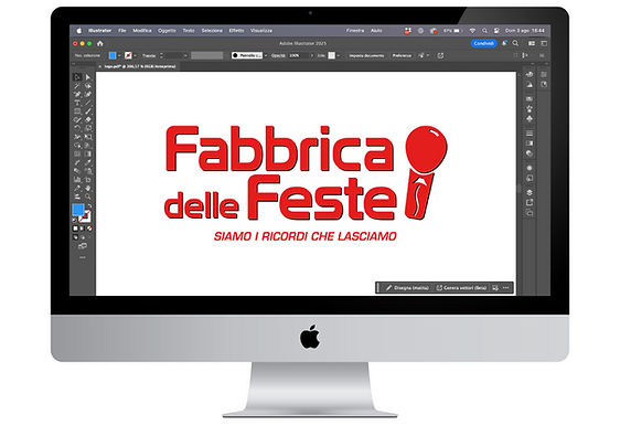
A microphone turned balloon becomes the core symbol of this playful, expressive identity.
The microphone speaks to the brand’s active role in planning, hosting, and guiding events, giving voice to your celebration and making you the star.
The balloon, timeless icon of any party, connects back to the brand’s roots in party supplies and themed decorations.
Together, they create a logo that celebrates joy, personality, and the power of a well-orchestrated party.