Today, anyone can create a graphic, tools like Canva or ChatGPT have made design more accessible than ever.
But real design is more than arranging elements on a canvas. It’s about understanding what the client wants, and often, what they can’t quite express, and turning it into something that speaks clearly, both visually and emotionally.
Over the years, I’ve worked on graphic projects for companies with very different goals, always starting from research: Who are we speaking to? What do we want to say and how should it feel?
For me, shape and function are inseparable. I aim to create visuals that not only look good, but carry meaning, clarity, and coherence because good design isn’t just seen, it’s felt.
PRINT DESIGN
BROCHURE


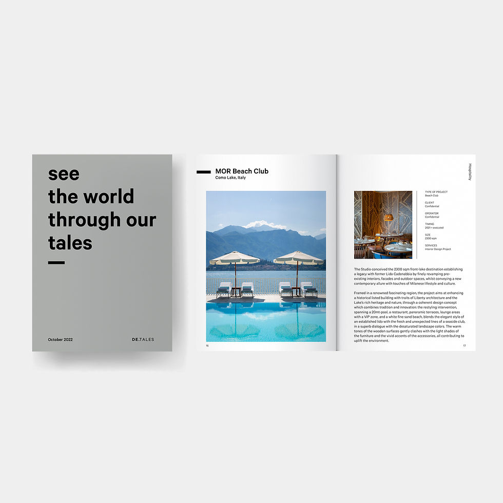
A brochure should capture attention, invite the reader to open it, and, once inside, guide them through a clear, well-structured, and engaging journey.
I always start with one question: What does the reader truly want to know? From there, I create a balance between visuals that make an immediate impact and concise yet comprehensive copy, designed to inform without ever overwhelming.
Every element, from typography to color palette to layout, is carefully chosen to reflect the brand’s values and style, turning the brochure into a tool that not only communicates but truly represents.
FLYERS
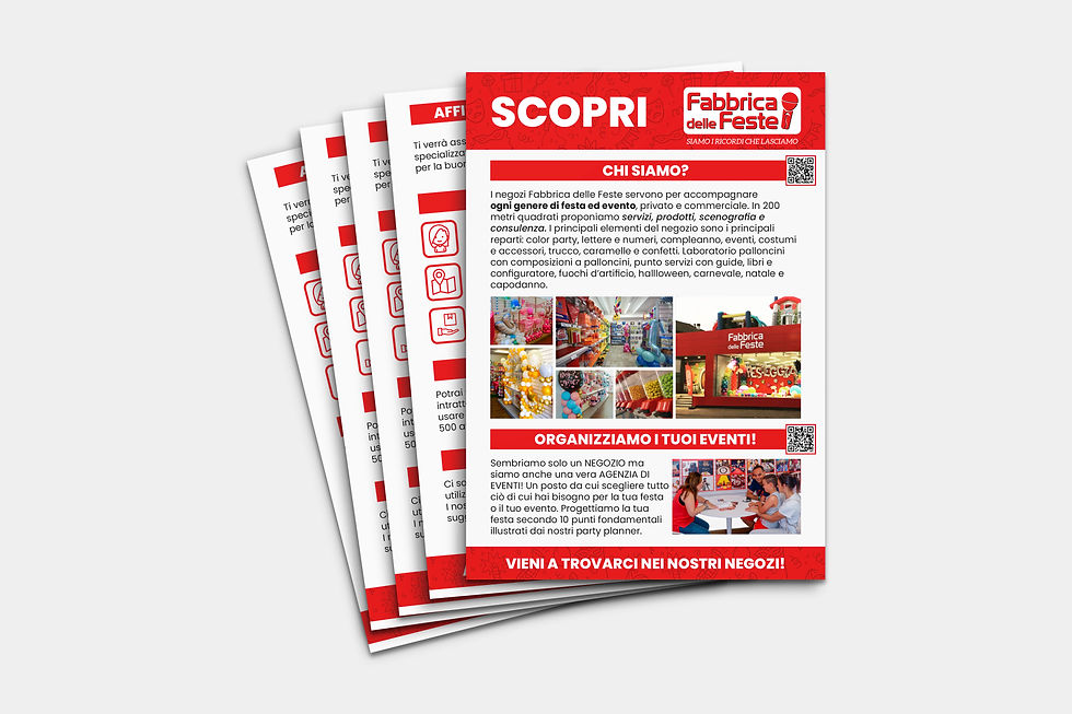
Today, creating a flyer may seem within everyone’s reach, but a good one is more than simply “putting together” text and images: it’s the perfect balance of clarity, visual impact, and the ability to spark curiosity.
The real challenge is saying a lot with very little space, carefully choosing words and visuals that speak directly to the right audience. AI can produce a beautiful design, but it can never replace the human understanding of how to structure information so that it truly resonates with the reader. The goal is to turn just a few lines and an image into a message that leaves a lasting impression.
BOOK


In a book, design shouldn’t dazzle with special effects, it should guide the reading experience naturally, almost invisibly.
When a layout is truly well-crafted, you don’t even notice it: the eye flows from page to page without obstacles, always finding the right support to understand and retain the content. This is where good design becomes “silent,” yet all the more essential.
For me, designing a book starts with a solid, functional structure, one that supports the content without ever distracting from it.
GAME RULES


Writing a rulebook for a board game is a completely different challenge from designing catalogs, books, or brochures. Here, functionality reaches its highest level: anyone approaching a new game wants to start playing right away.
In the era of video games, where tutorials guide players step-by-step from the very start, a board game rulebook must achieve the same — but on paper. Every piece of information, every step, and every graphic element should follow the natural flow of someone learning, getting them to their first game as quickly as possible.
A good rulebook is both comprehensive and quick to consult during play, ensuring the flow of the game is never interrupted. This is where graphic design becomes a crucial ally, guiding the reader and making it easy to retrieve information instantly.
CATALOGUES

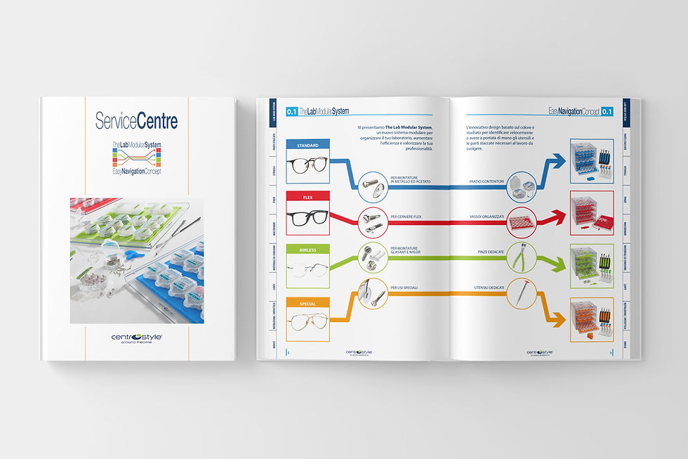
A catalog's success depends on order and clarity. Its heart is the summary because most people don't browse it from cover to cover; they jump straight to what they're looking for. This is why a logical structure and effective content grouping are essential for an immediate and intuitive browse experience.
Inside, every product needs its own visual identity. This specific graphic language should grab attention while seamlessly integrating into a cohesive overall layout. This approach ensures readers instantly recognize that every element belongs to a single, consistent, and strong brand.